Kathy Kranias
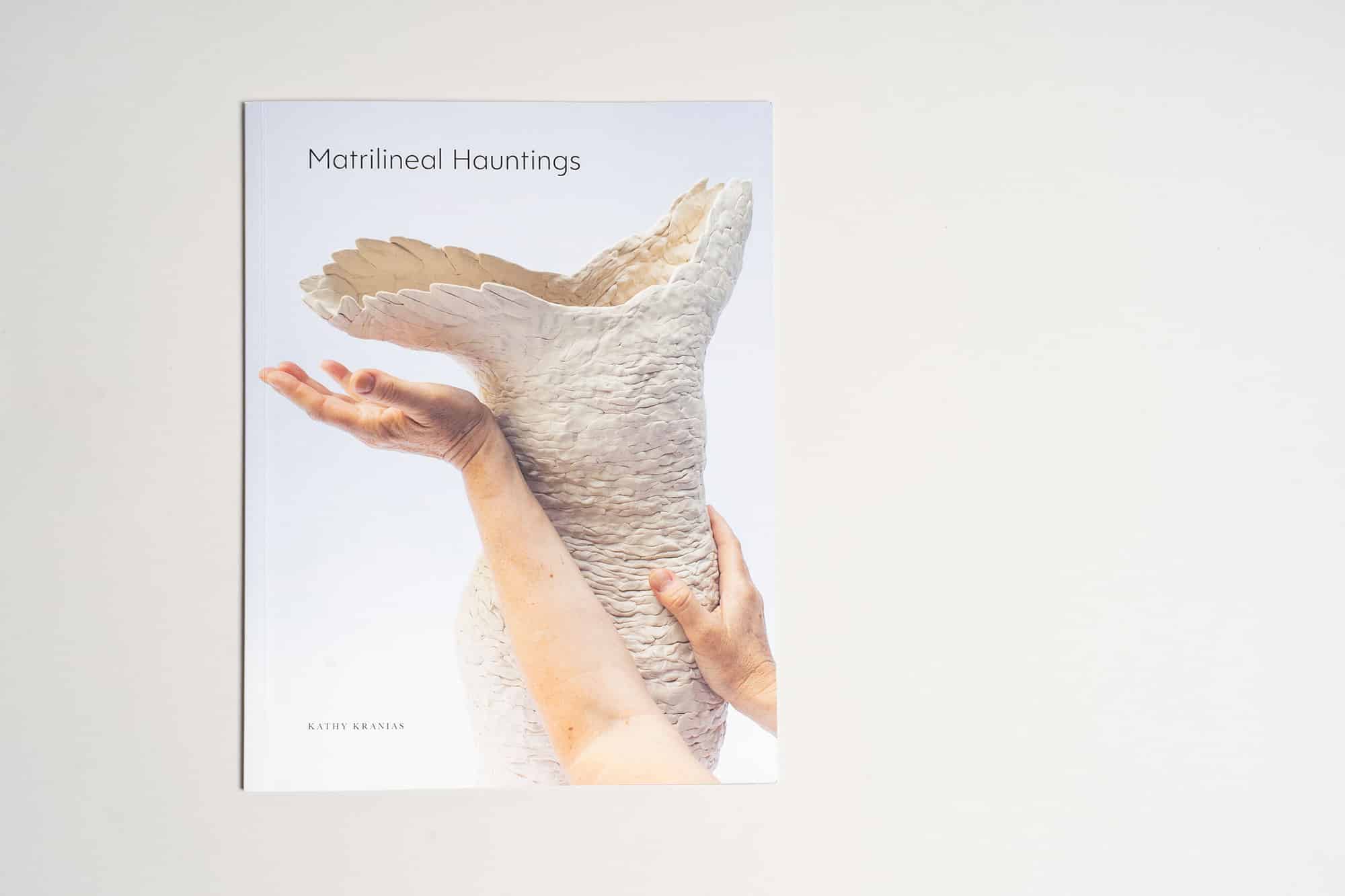
Matrilineal Hauntings: A Catalogue of Courage and Transformation
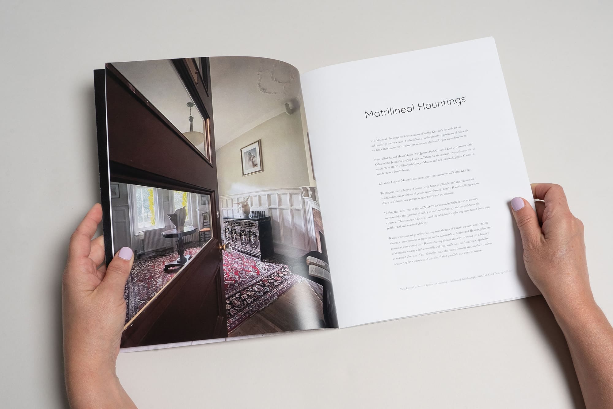
When Marina Dempster first told me about Kathy Kranias and her remarkable exhibition Matrilineal Hauntings, I knew this would be more than just another catalogue project. Kathy had created something extraordinary — an exhibition that confronted her colonial family history and the legacy of domestic violence in her matrilineal line, housed in the very Toronto Victorian home built by her British ancestors.
This wasn’t simply about documenting artwork. It was about preserving an act of incredible courage — a reckoning with the past that demanded to be held and remembered. Kathy wanted to create a catalogue to accompany her travelling exhibition, understanding something profound: these ceramic sculptures and collaborative photographs deserved a tangible form that could carry their story far beyond gallery walls.
Creating Space for Haunting Beauty
Designing with reverence for difficult truths
Kathy arrived with clear aesthetic preferences and deep understanding of her work’s emotional needs, then allowed space for design solutions to emerge naturally. She wanted sophistication and minimalism that would create a reflective mood — something that honoured both the stark beauty of her unglazed ceramic forms and the weight of the stories they carried.
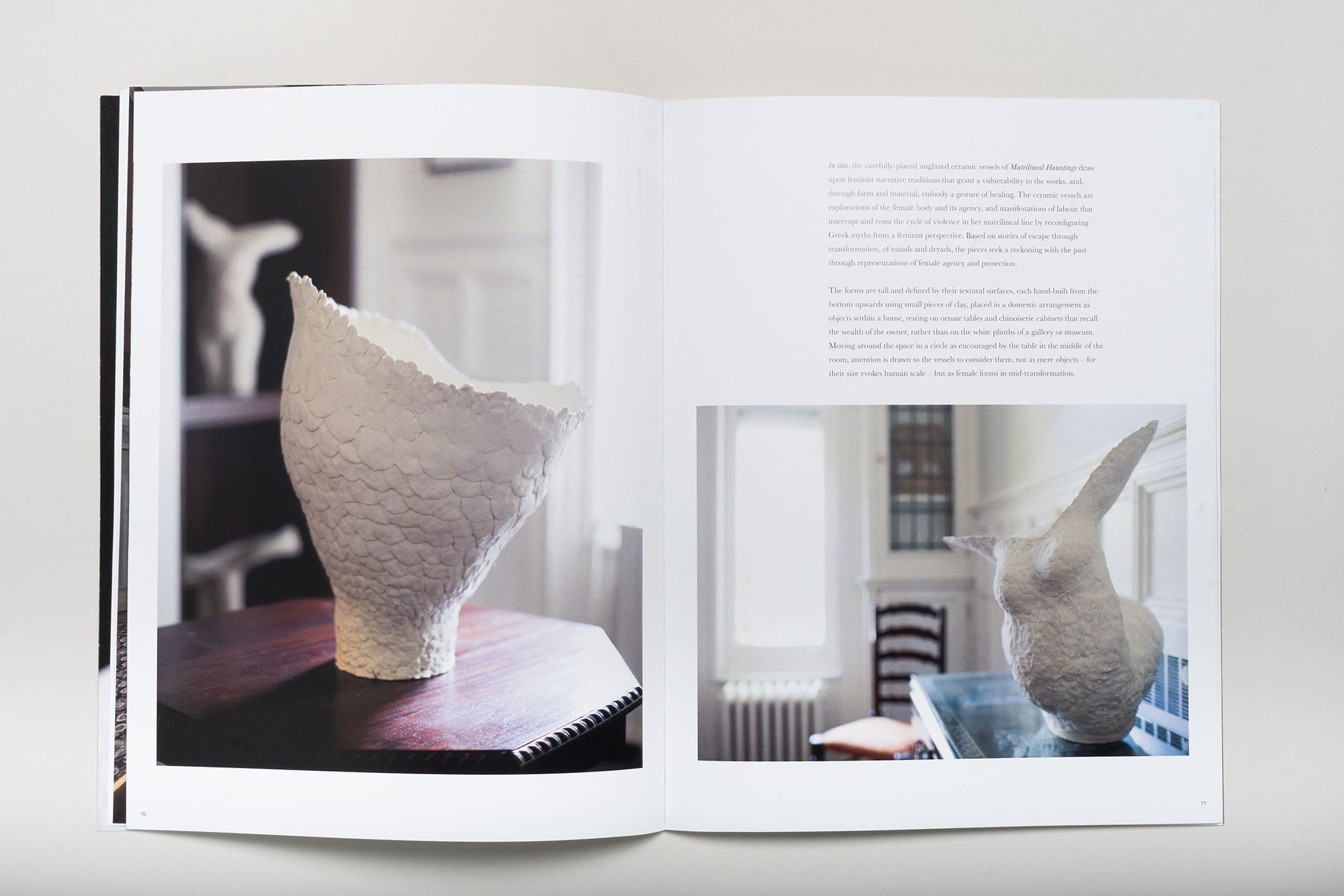
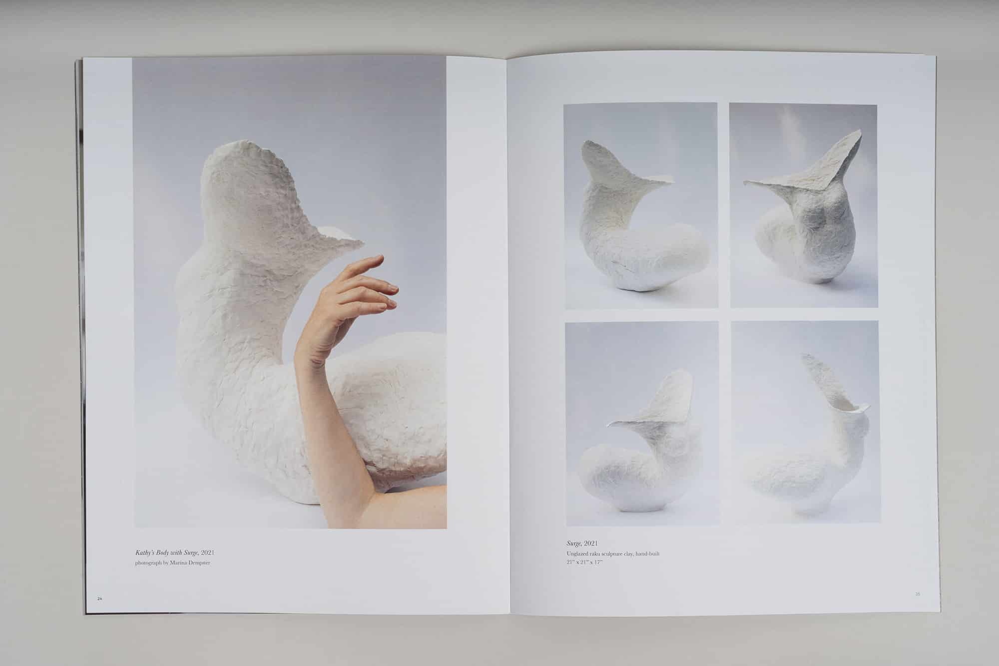
Her sculptures were breathtaking. Hand-built from small pieces of clay, each piece embodied transformation and resilience — drawing from Greek myths reimagined through a feminist lens, where Daphne’s transformation into a tree becomes protection rather than punishment. Marina’s photographs captured not just the sculptures themselves, but their evocative presence within the parlour of that Victorian home, and the deeply moving collaborative images of Kathy’s own body interacting with her ceramic forms.
I knew immediately that the design needed to step back and let these powerful images breathe. The photographs themselves were doing the storytelling — my job was to create the quietest possible stage for them to speak.
Design as Witness
When less truly becomes more
Every choice felt significant. These weren’t just aesthetic decisions — they were about creating the most respectful, elegant container possible for such vulnerable, important work.
I chose not to use colour in the layout, letting the photographs carry all the visual weight. The images themselves were so compelling — the mysterious interplay of ceramic forms within ornate Victorian architecture, the tender vulnerability of Kathy’s collaborative photographs with Marina. Any additional colour would have felt like interference.
Typography became about creating gentle rhythm and generous space. I selected elegant, slightly curvaceous sans serif fonts that echoed the biomorphic forms of Kathy’s sculptures without competing with them. The layout remained deliberately spare — lots of white space, room for reflection, pages that invited contemplation rather than rushed consumption.
A meaningful design decision was using close-ups of the sculptures’ textured surfaces for the inside cover spreads. Kathy wanted readers to experience the tactile quality of her hand-built work, the scales and smoothed surfaces that suggested both armour and transformation. These details became like opening and closing meditations, bookending the catalogue with the physical reality of clay worked by caring hands.
Weaving Story and Image
Creating flow through profound content
The collaboration felt like being invited into something sacred. Reading through Lera Kotsyuba’s curatorial essay and Kathy’s artist statement, I began to understand how each element needed to support the others. This wasn’t just a portfolio of images — it was a complete narrative about confronting family history, the intersection of personal and political violence, and the possibility of healing through creative work.
I carefully matched text with corresponding images, ensuring that when Lera wrote about specific sculptures, readers could see them immediately. When Kathy described her collaborative process with Marina, the images appeared in dialogue with her words. The flow had to feel intentional yet natural — like walking through the exhibition itself, discovering each piece in its proper context.
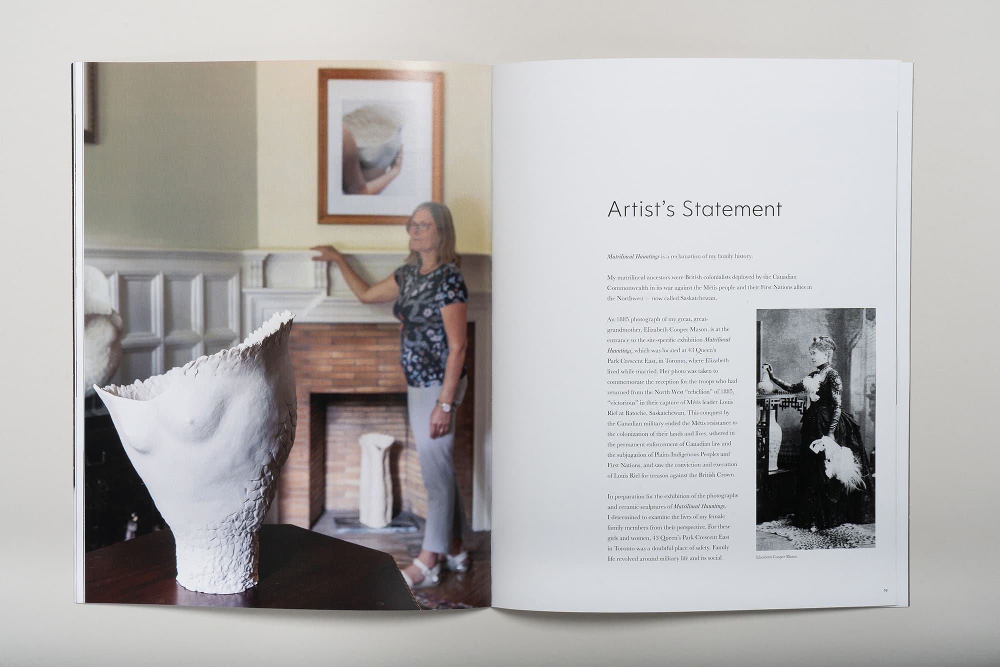
The catalogue opens with context — Lera’s essay situating the work within the architecture and history of that Toronto home. Then Kathy’s own voice emerges through her artist statement, before we move into the heart of the work: the sculptures themselves, presented with Marina’s installation photographs and their beautiful collaborative images.
More Than Documentation
Creating legacy through design
What struck me most about this project was understanding what the catalogue would become. These sculptures were travelling across the country, being exhibited in different contexts far from their original home. The catalogue wasn’t just documentation — it was the one constant that could carry the complete story to every new venue.
For visitors encountering the work in different galleries, the catalogue would provide the crucial context of place and family history that gave the sculptures their full meaning. It would preserve forever the haunting beauty of seeing these ceramic forms within that Victorian parlour, surrounded by the architectural remnants of colonial wealth and domestic complexity.
But beyond its practical function, the catalogue became something more precious — a permanent testament to Kathy’s courage in confronting difficult family truths, and to the transformative power of making art from pain.
Legacy in Hand and Heart
When catalogue becomes treasure
Matrilineal Hauntings represents everything I believe about the power of thoughtful publication design. It proved that a catalogue can be far more than promotional material — it can become a sacred keeper of stories, a bridge between past and present, a tangible form that honours the courage required to transform pain into beauty.
Months after the catalogue’s completion, I still think about those ceramic sculptures and what they represent. Kathy’s willingness to examine her family’s difficult history, to place her intimate artistic interventions within the very architecture of colonial power, created something unprecedented. The catalogue ensures that this profound work will continue to speak to people long after the last exhibition closes.
There’s something deeply moving about holding such important work in your hands — feeling the weight of the paper, seeing how the images and text work together to tell a story that needed telling. In our digital age, Matrilineal Hauntings reminds us why some stories demand physical form, why some acts of courage deserve to be preserved as tangible treasures that can be shared, kept, and returned to whenever their wisdom is needed.
What Kathy Says About Our Collaboration
“It was a positive process to work with Leelee on my book project. Leelee’s design solutions were creative and functional, and she gave careful consideration to connecting images and text in her design. Leelee’s organised and efficient system of working online made the whole process enjoyable.”
— Kathy Kranias, Artist, Educator and Art Historian